
Branding · Print · 2026
Big Horne Towing
A bold illustrated identity for a towing and recovery company, designed to stand out on white service vehicles and remain recognizable at any scale.
Overview
Big Horne Towing
Big Horne Towing provides vehicle towing and recovery services. The brand concept draws directly from the owner's surname, using a bighorn sheep as a memorable visual anchor for a company built around strength, reliability, and roadside support.
Challenge
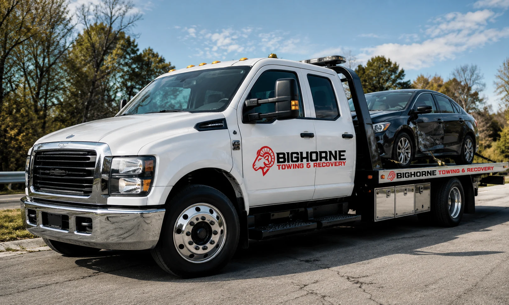
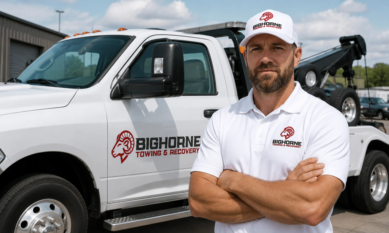
The identity needed to feature a bighorn sheep without becoming overly detailed or difficult to reproduce. It also had to read clearly on the company's primarily white tow trucks and work as both a full lockup and a standalone emblem for apparel and future brand applications.
Solution
I illustrated a compact bighorn sheep mark with strong contours and an assertive profile, then paired it with bold, condensed typography suited to vehicle graphics. A red, black, and white palette creates high contrast on the fleet while keeping the system direct and professional. The mark can stand on its own or sit beside the company name and tagline, giving the brand flexibility as the business expands across print and digital touchpoints.
Services provided
Brand Identity, Logo Design, Custom Illustration, Visual Identity, Vehicle Graphics, Apparel Branding, Print Design
Your project
Need a clear creative solution?
Tell us what you're trying to launch, improve, or produce.
Start a Project