
Branding · Signs · 2024
edified
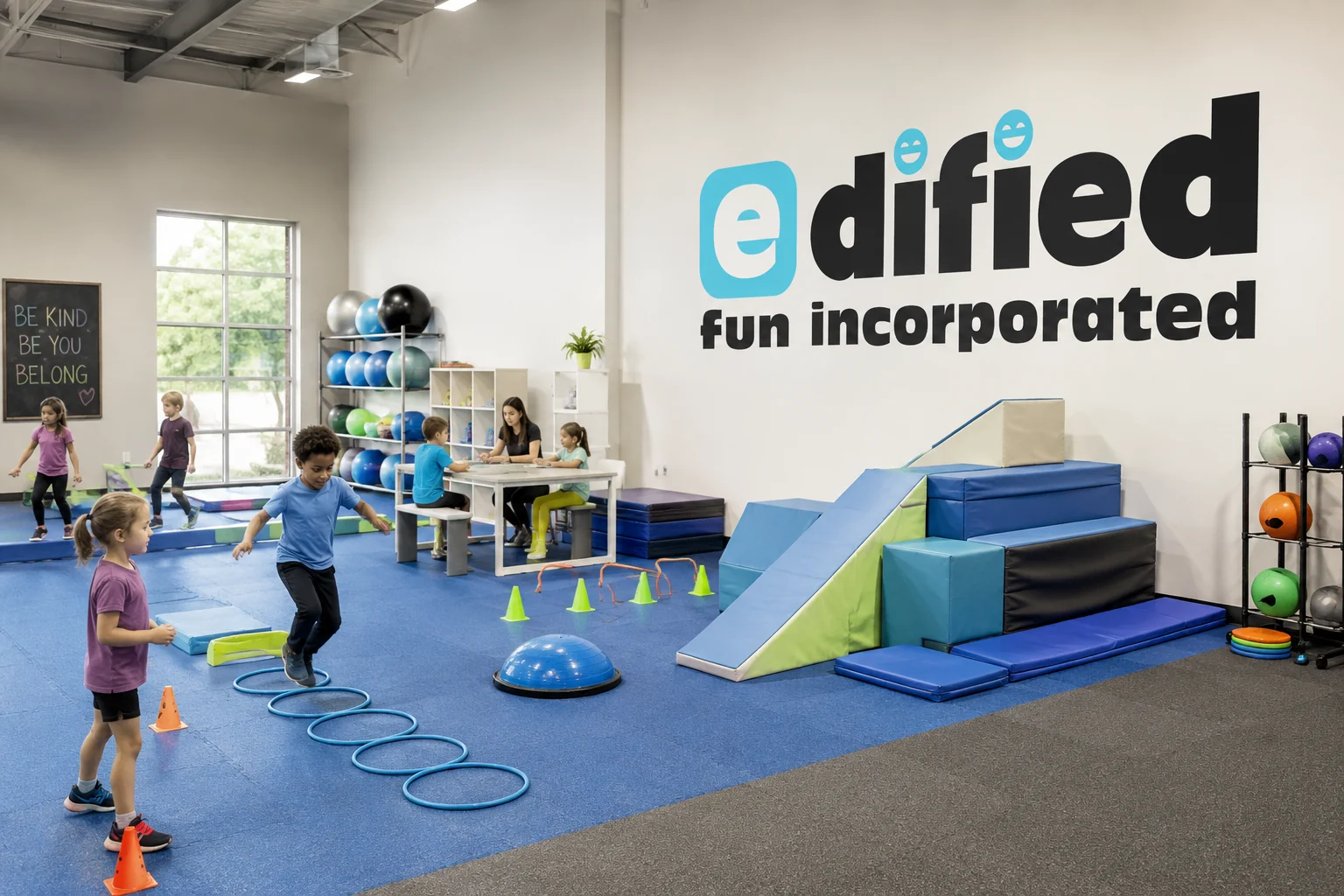
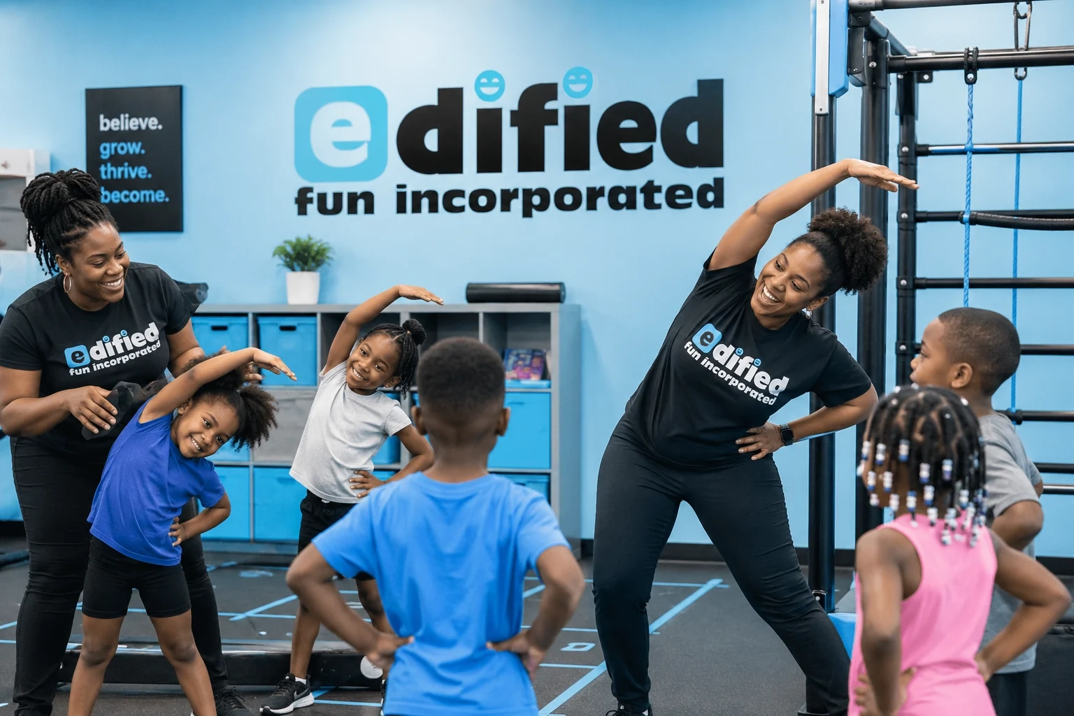
A playful wordmark and environmental identity for a youth wellness organization that makes movement, exercise, and healthy play feel fun.
Overview
edified
edified is a youth-focused organization that uses kid-friendly activities and exercise to make playtime both fun and healthy. The brand needed to feel energetic and approachable for children while remaining polished enough for parents, staff, and community partners.
Challenge
The client wanted the name to remain the centerpiece and preferred to avoid a literal mascot or activity-specific symbol. The challenge was to create a distinctive typographic identity that felt playful, could support a standalone icon, and would scale across apparel and interior environments.
Solution
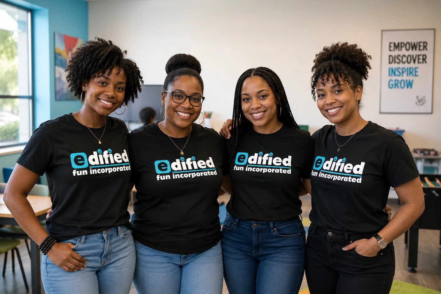
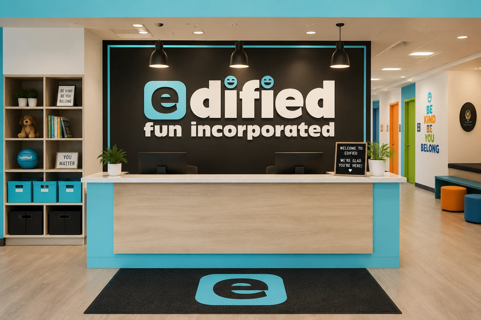
I selected a rounded, cartoon-inspired typeface as the foundation and customized the letterforms to give the wordmark its own personality. The leading e is emphasized as a compact brand mark, while the two i dots become a smiling face that adds warmth without introducing a separate illustration. Teal, black, and white create a bold, gender-inclusive palette that stays clear across staff apparel, activity spaces, reception signage, and environmental graphics.
Services provided
Brand Identity, Wordmark Design, Custom Typography, Logo System, Apparel Graphics, Interior Signage, Environmental Graphics, Youth Program Branding
Your project
Need a clear creative solution?
Tell us what you're trying to launch, improve, or produce.
Start a Project