
Branding · Print · Signs · 2017
Palmetto Community Church
A fresh, youth-focused church identity built to work across exterior signage, apparel, merchandise, and everyday community touchpoints.
Overview
Palmetto Community Church
Palmetto Community Church is a Christian church with a strong emphasis on youth ministries, activities, and an approachable community atmosphere. The rebrand needed to replace an outdated identity with a clearer, more energetic visual system that reflected how the church's members and pastor already spoke about it: simply as PCC.
Challenge
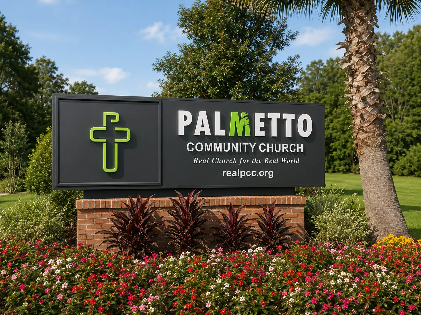
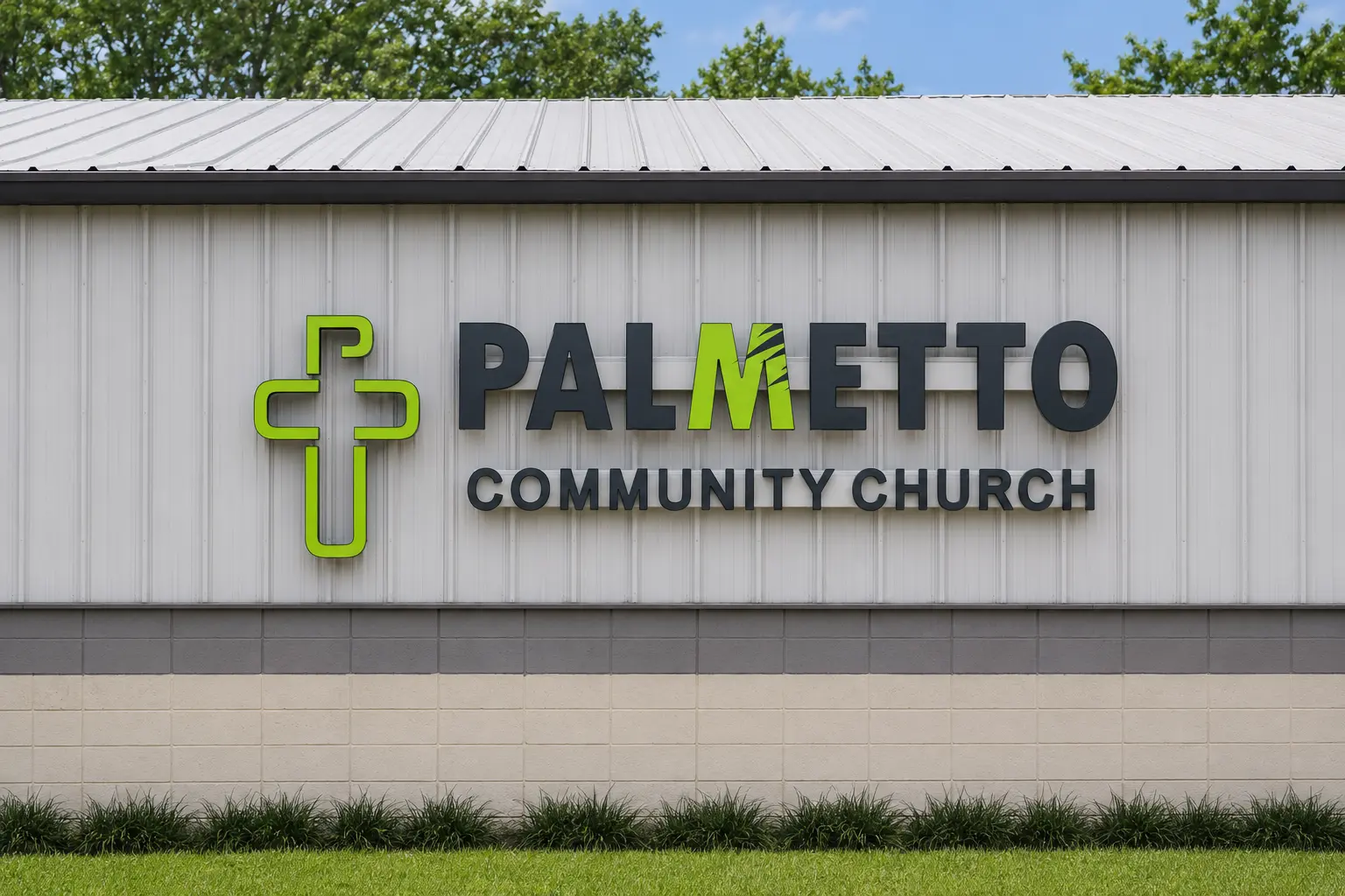
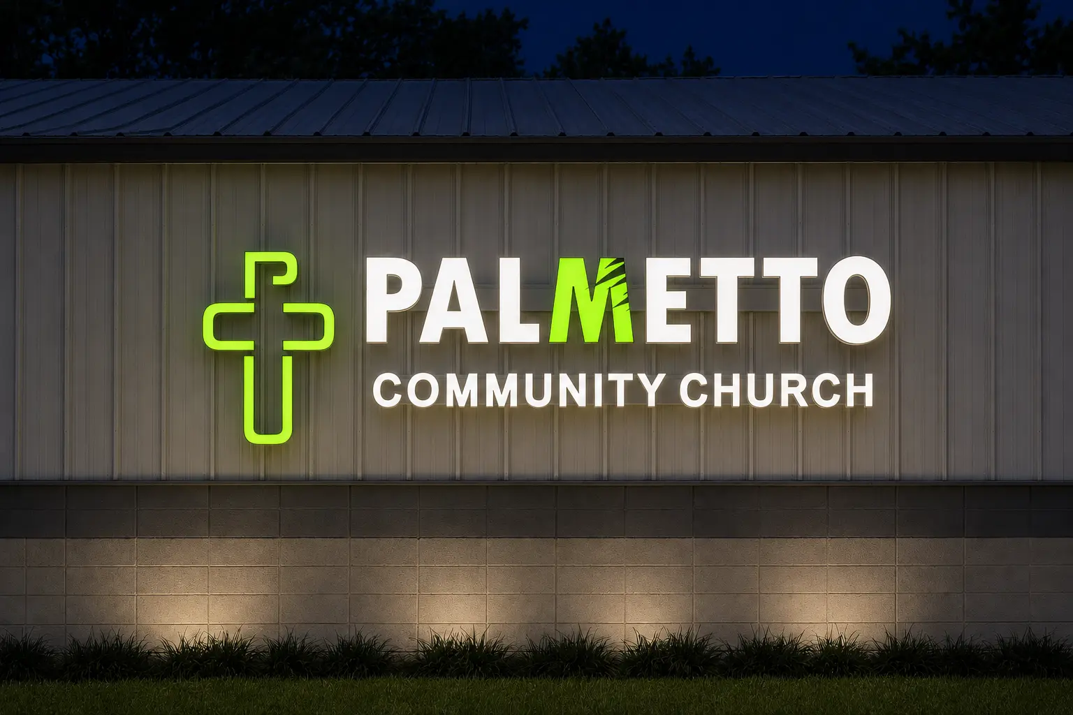
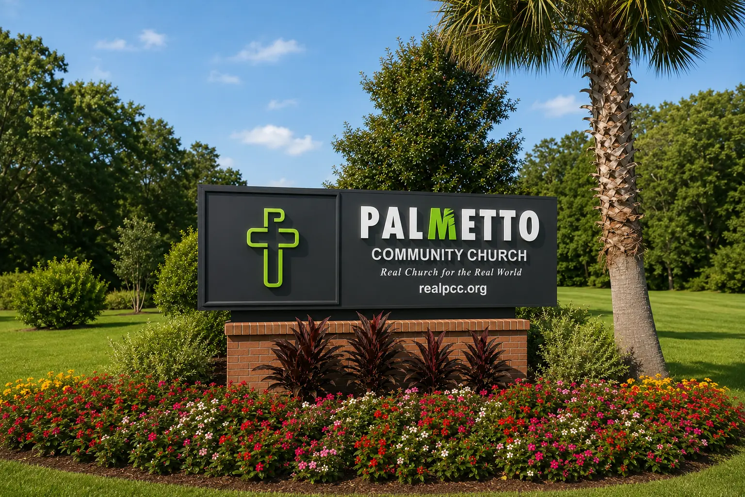
The previous logo was difficult to understand and was not constructed to reproduce consistently across branding or large-format signage. The new identity needed to feel fresh and youth-oriented while remaining appropriate for the wider congregation. It also had to translate cleanly into two funded exterior sign projects, where legibility, fabrication, illumination, and distance viewing were essential.
Solution
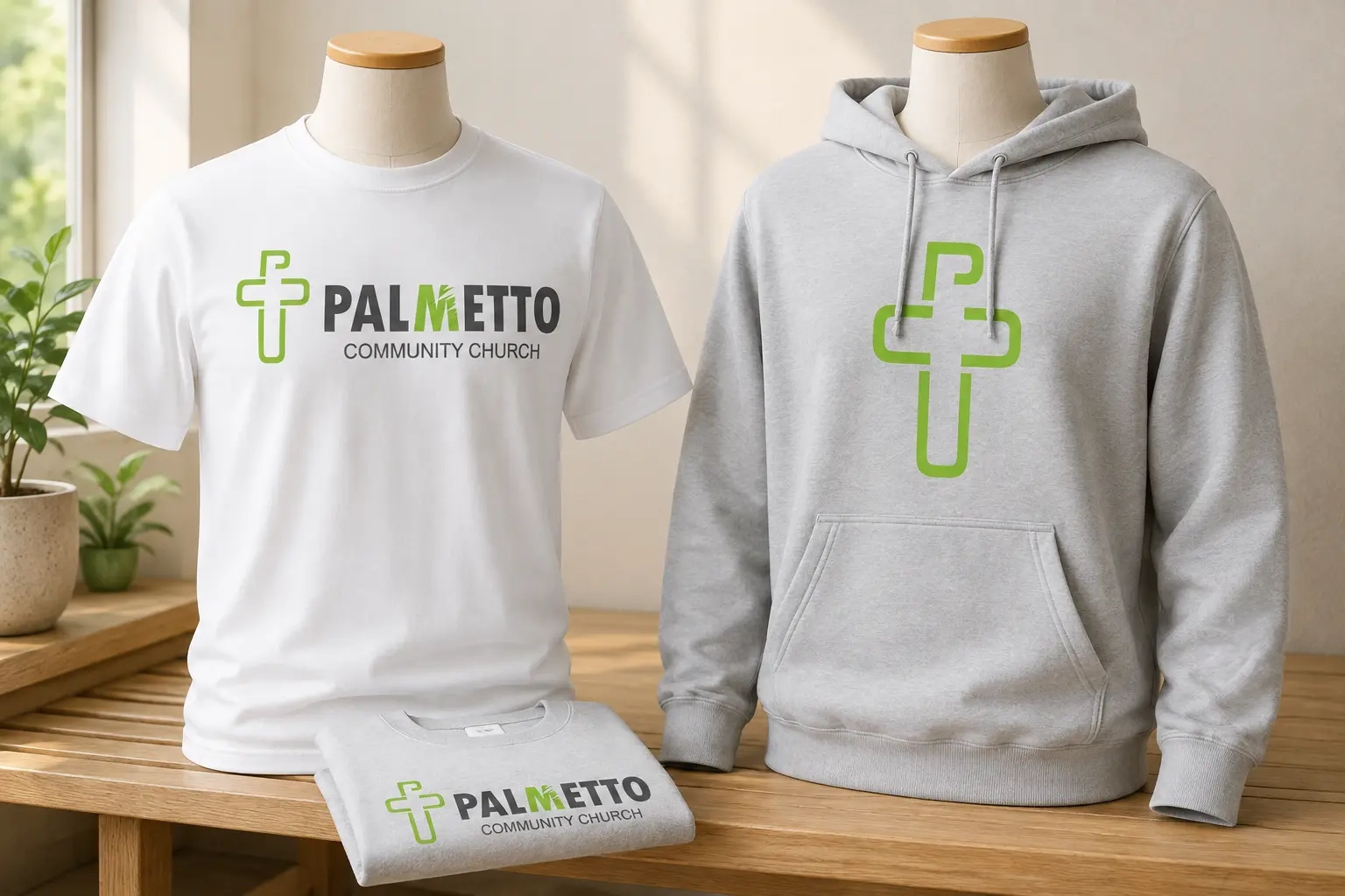
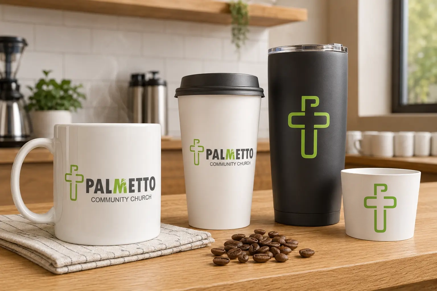
I created a cross-shaped logo mark built from the initials P, C, and C, turning the church's familiar shorthand into a meaningful and recognizable symbol. Bright green communicates the energy of the youth ministries and the church's progressive, casual atmosphere, while charcoal and white provide clarity and balance. Palm leaves integrated into the M of Palmetto preserve a visual link to the previous identity and reference the palm trees associated with South Carolina. The resulting system scales from drinkware and apparel to monument and building signage, including illuminated applications that remain clear after dark.
Services provided
Brand Identity, Logo Design, Identity Refresh, Youth Ministry Branding, Apparel Graphics, Merchandise Design, Environmental Signage, Monument Signage, Building Signage, Sign Planning & Production
Your project
Need a clear creative solution?
Tell us what you're trying to launch, improve, or produce.
Start a Project