
Branding · Print · Signs · Websites · 2016
Quad E
A welcoming nonprofit healthcare identity designed to connect free and low-cost services with families and underserved communities.
Overview
Quad E
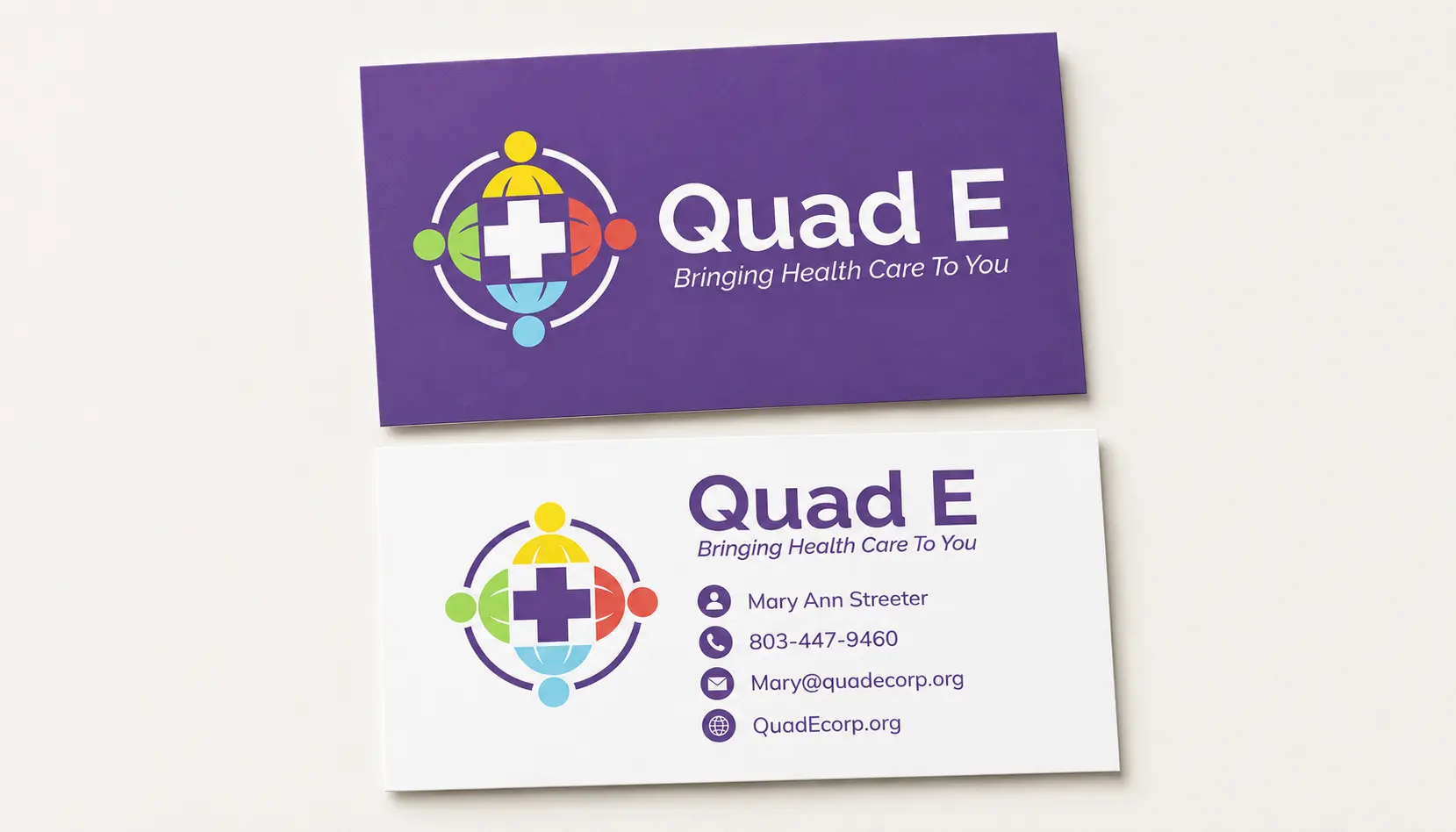
Quad E is a nonprofit organization specializing in free and low-cost healthcare. The identity was created to feel welcoming, inclusive, and child-friendly, reflecting the organization’s focus on pediatric care, family activities, and community events. Rather than presenting healthcare as distant or institutional, the brand emphasizes access, compassion, and the four principles behind the name: Educate, Empower, Eradicate, and Engage.
Challenge
The challenge was to distinguish Quad E from conventional healthcare providers and create a more communal identity that authentically represented the predominantly African American communities it serves. The system also needed to make the four E’s visible in spirit while remaining flexible enough for outreach events, apparel, signage, vehicles, stationery, and digital use.
Solution
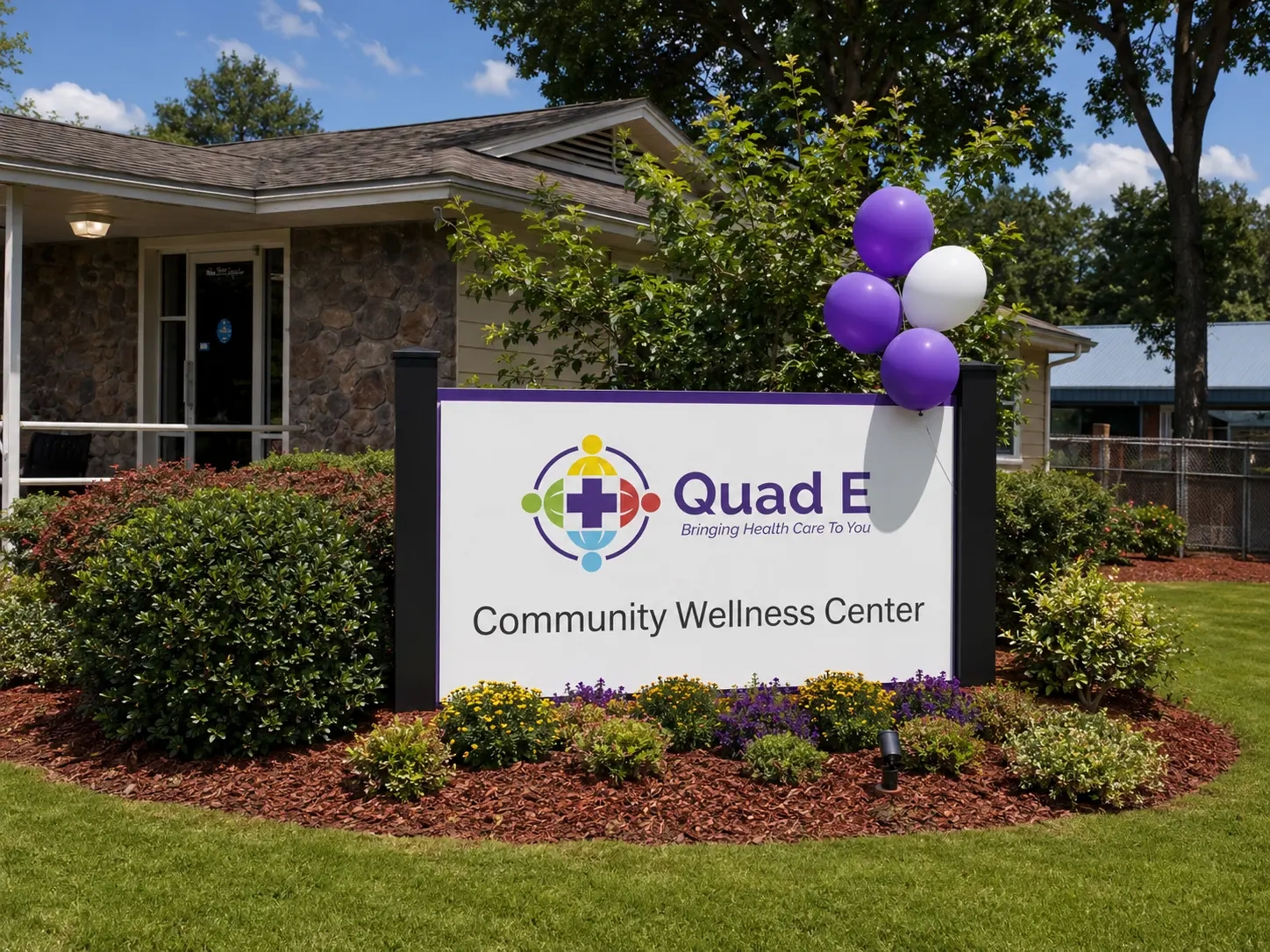
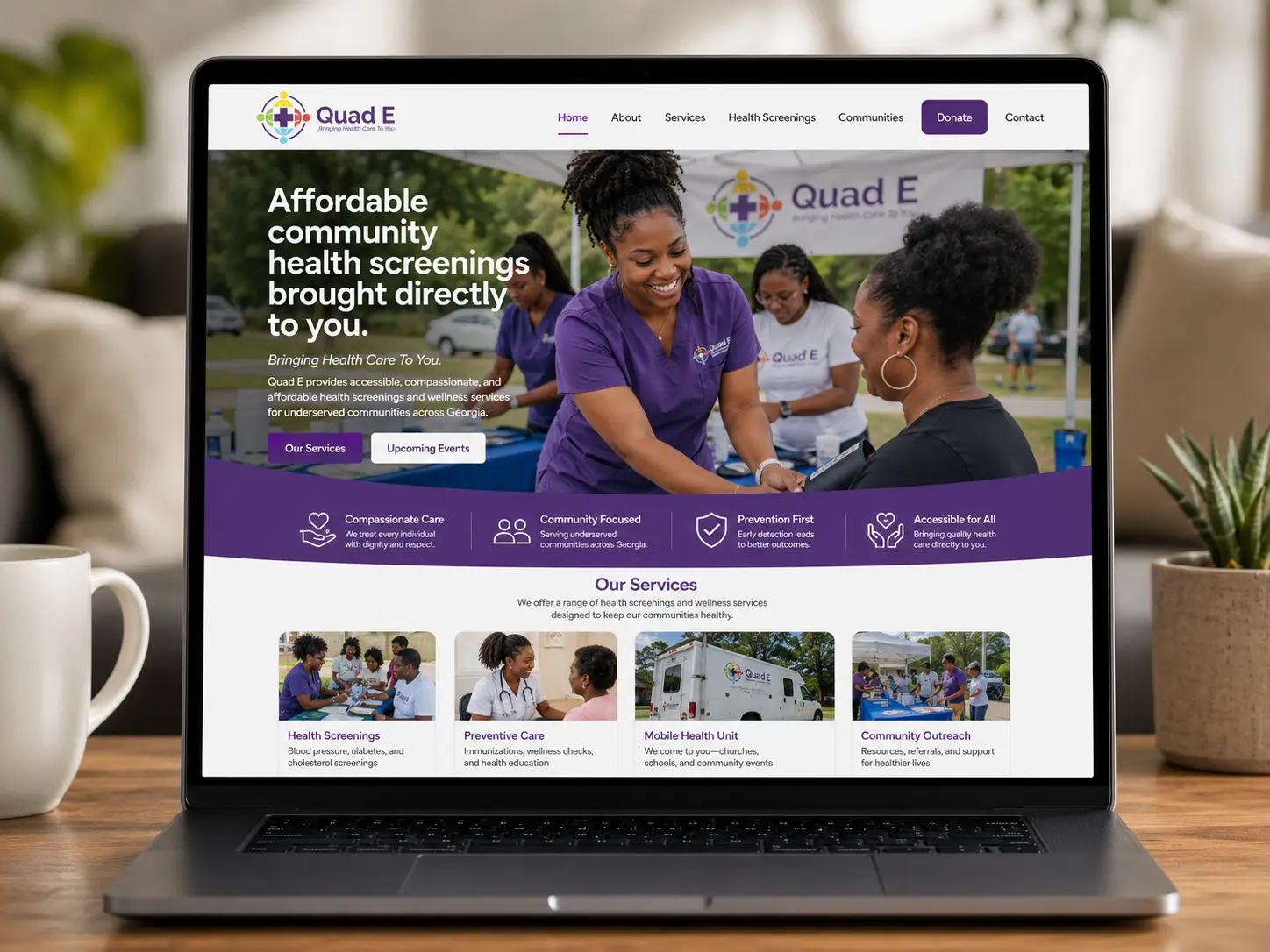
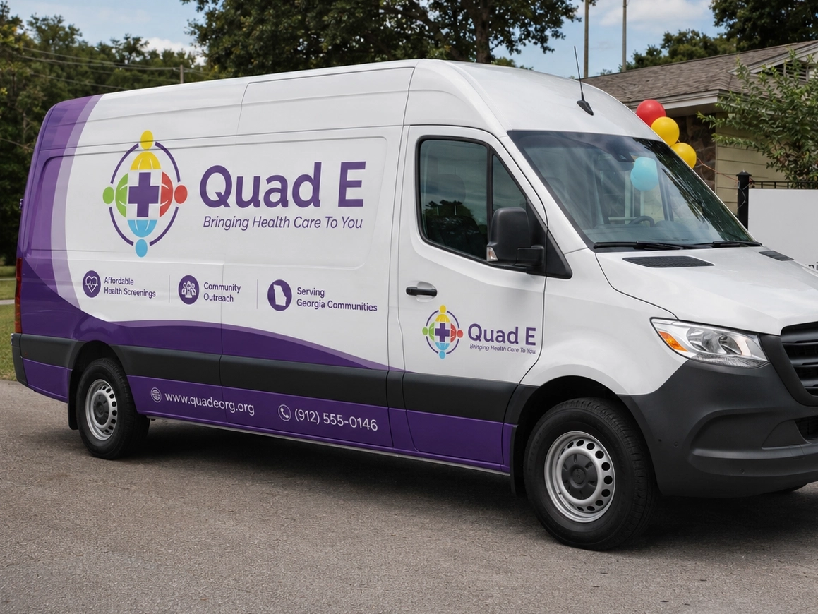
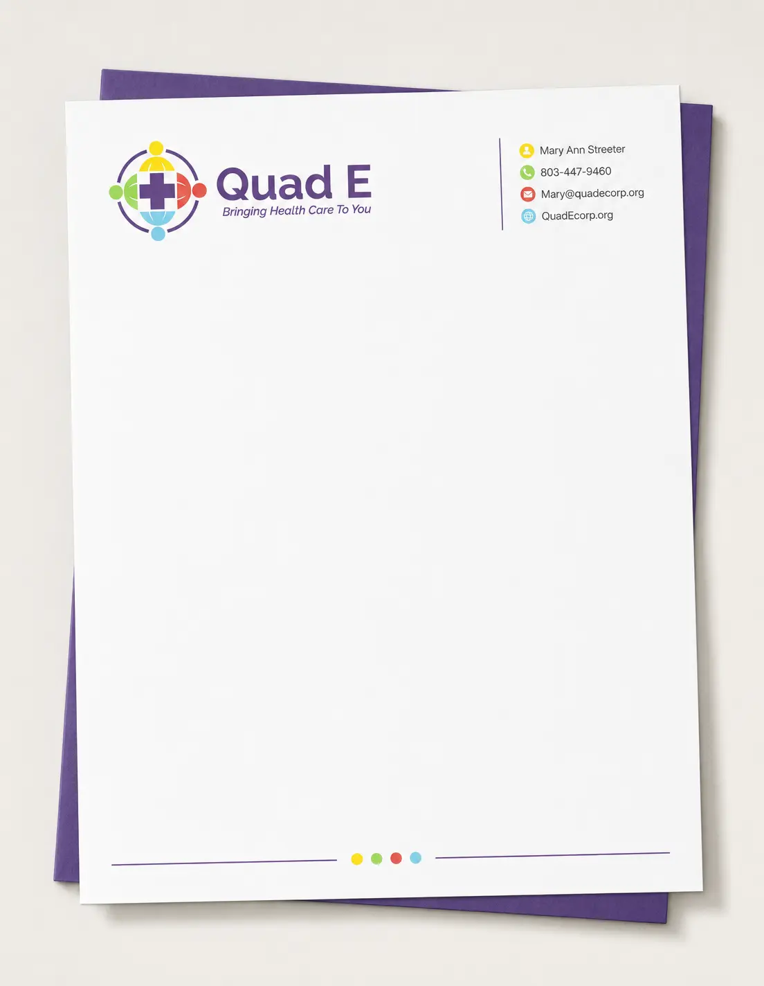
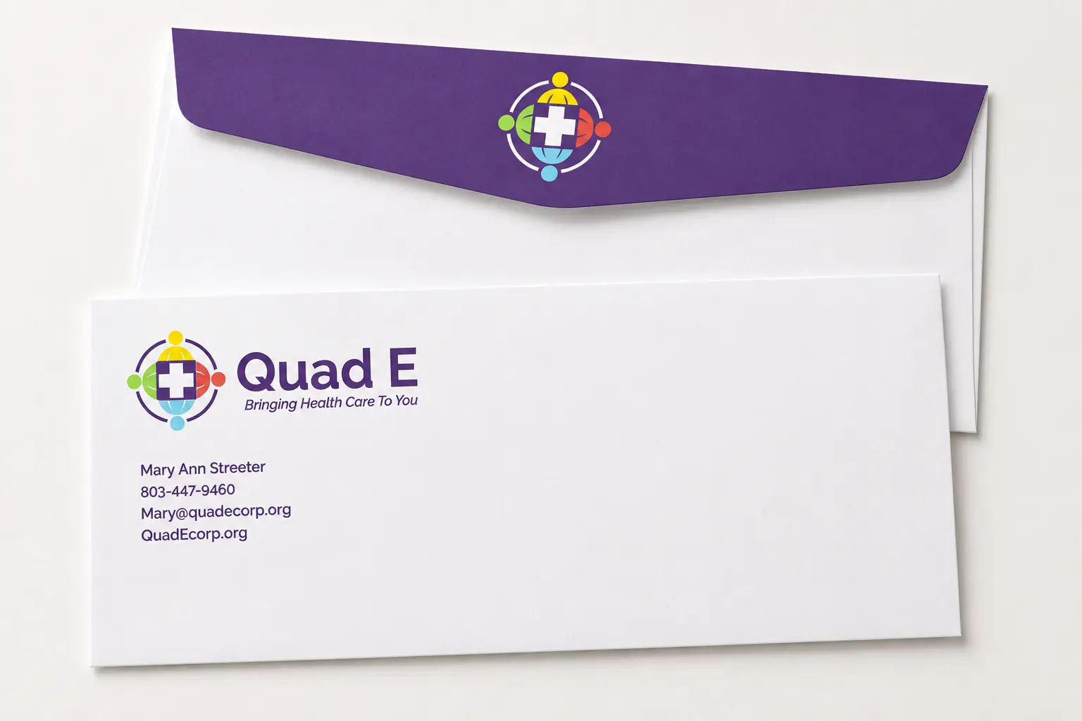
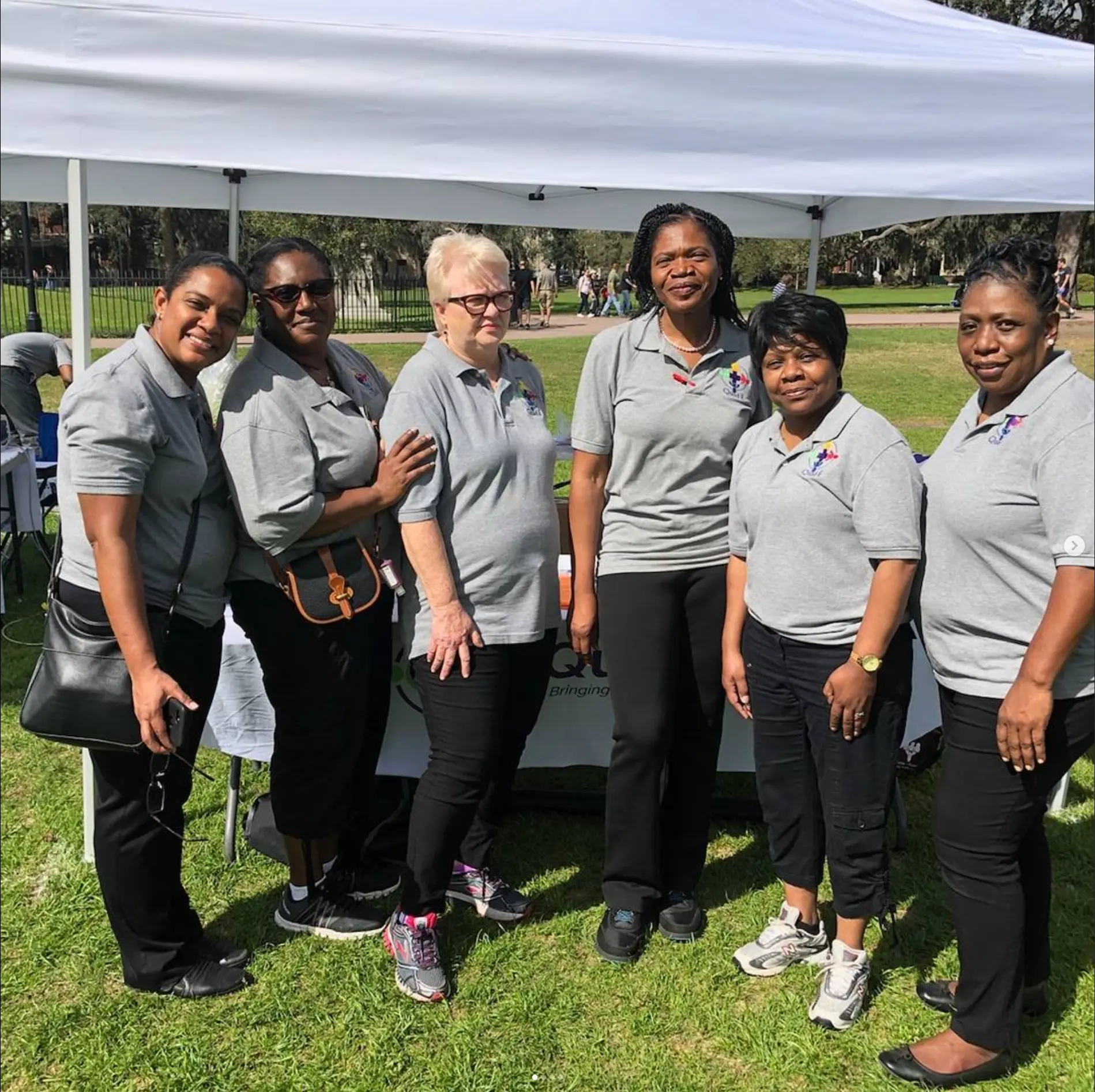
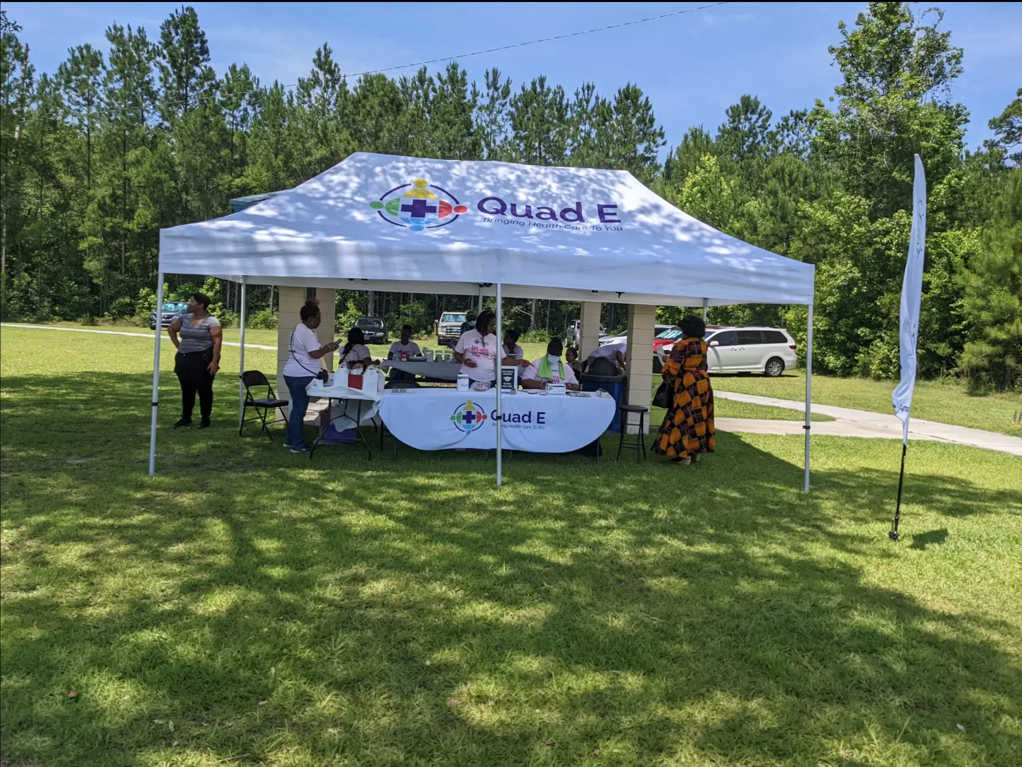
I designed the primary logo around four human symbols in distinct brand colors, arranged around a central medical cross to communicate diversity, care, and collective action. Purple anchors the identity across the wider marketing system, while the supporting colors keep it energetic and approachable for families and children. Multiple logo configurations and a consistent application system allow the brand to work clearly across small printed pieces, large-format signs, event canopies, uniforms, a mobile healthcare vehicle, and the organization’s website.
Services provided
Brand Identity, Logo Design, Print Collateral, Environmental Signage, Vehicle Graphics, Event Branding, Apparel Graphics, Website Design
Your project
Need a clear creative solution?
Tell us what you're trying to launch, improve, or produce.
Start a Project